ShopDreamUp AI ArtDreamUp

Deviation Actions


Suggested Deviants


Suggested Collections


You Might Like…


Comments12
Join the community to add your comment. Already a deviant? Log In
Ahhh when I saw these lil' birbs I just had to leave a critique! They're so cute! ^.^
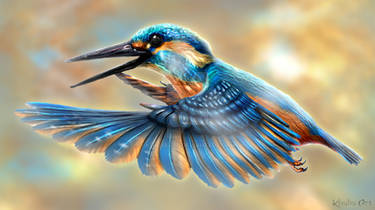
Since this looks a little bit more like a study, I'll be critiquing based on the individual birds and not necessarily how the piece comes together as a whole.
STRENGTHS:
Coloring
The coloring on the birds is incredibly prominent and I can see is a little more saturated then how you might find them in real life. However, at the same time it doesn't feel like it takes away from the natural, realistic look of these birds. They're able to maintain a semi-realistic look while being accented with a pop of additional vibrance. I'd love to see a painting of these birds fluttering about in an equally colorful world!
The iridescence on the starling is spectacularly done. It's the first thing I noticed when I saw this image! The heavy black shading really brings out the shimmering greens and blues. Additionally, you've crafted the iridescence in such a way that it helps bring this bird off the screen. Of the three, the starling definitely looks the most dimensional, very much as a result of how the iridescence was applied.
Form
You've definitely picked up up quite a variety of birds! And they're all different shapes and sizes out in the wild! I can see that you've taken a lot of care in maintaining the structure and form of these birds. If you grabbed an ornithologist and had nothing but silhouettes in your drawing, I bet they'd easily be able to identify the species. The puffiness of robins, the rigid alertness of waxwings...it's all reflected so well in how you've portrayed them in you work.
Angle
Just for the piece overall, I enjoy that you've tackled different positions and angles. And they all came out looking fantastic! My personal favorite is the front-faced view of the robin. He looks so curious and perky!
Texturing
Yay for textures! Lovely job on the fine texturing work for the feathers and the feet. I can see the rough scales armoring the legs. And the iridescence on the starling really comes out with the fine lines you've applied. The fine feathering work on the robin and the scaled, overlapping feathers on the starling and waxwings wings further contribute to that realistic look.
Other Highlights
Goodness the eyes look photo-realistic! The way you've applied the highlights and shading really breathes life into the entire bird. It doesn't take too much imagining to see these little birds flying about, swiftly turning their heads and hearing their intricate songs. Those eyes really tie up all the elements of the bird and package them nicely with a bow.
AREAS FOR IMPROVEMENT:
Detail
You've done a marvelous job adding some very fine and intricate details. But in a few other areas you've seem to have bypassed it completely. This adds an unusual contrast and discord that just barely leaves the birds a little short of reaching their full artistic potential! For example, the robin has been sculpted out and chiseled with short, swift lines indicating feathers down its chest and the rest of its body. However, the brown top of its head is all a solid color. I would apply just a few more lines to the head as a final touch. Portions of the waxwing, especially in the underbelly area, also seem to be lacking that some detailed touch.
Other details seem to have been a little rushed.While the scaling work for the wings adds dimension and texture, it also looks a tad unrefined in comparison to some of the other details. This stands out most prominently with the waxwing. I'd work on adjusting the upper portion of its wing to make it fit in a bit more with the other portions.
Shading
The shading on the robin and starling were very well done. But the waxwing seems to fall just a tad short. The harsh shading on its upper wing makes it look somewhat flat and takes away from the realistic look. Additionally, there seems to be very little shading applied to the belly. Coupled with the lack of texturing, the style of the waxwing doesn't quite fit that of the other two birds. I'd work on fleshing him out a little more so that he can really settle in as part of the flock!
Overall fantastic work! <img src="e.deviantart.net/emoticons/s/s…" width="15" height="15" alt="